Create Wine Labels for Gifts and Beginners: Easy Guide


You can make a print-ready wine label file and have it printed same-day in one afternoon using free templates and a handful of design rules. No design degree required. Here’s the short version:
Must-do checklist: measure your bottle’s smooth area, pick a label size and style, set your file to CMYK and 300 DPI, export a PDF with 1/8" bleed, and choose your material.
Next steps at a glance:
Download a free template (Canva, Adobe Express, or Avery)
Export your design as a print-ready PDF
Print one test label on your chosen material
Apply to a clean, dry bottle and check fit
That’s the whole game. Keep reading for the details that make the difference between a label that looks homemade and one that looks like it came off a real shelf.
Table of Contents
How to Create Wine Labels: Step-by-Step from Idea to Bottle
Define your purpose. Is this a birthday gift, a party favor, or a personal homebrew? Your answer shapes everything from style to the words on the label. Keep it simple: one occasion, one vibe.
Measure your bottle. Measure the smooth cylindrical section of the bottle, not the shoulder or the tapered neck. A common starter size for standard wine bottles is around a few inches tall and wide, but always verify against your actual bottle before downloading a template.
Build your layout. Arrange elements in order of importance: brand name or recipient’s name at the top, wine type or occasion below it, then vintage or ABV if relevant, and a small tasting note or tagline at the bottom. If your label is for retail, the TTB requires brand name, class/type, ABV, net contents, and a government warning — gift labels should still avoid misleading claims.
Set your file specs. Work in CMYK color mode at 300 DPI. Add 1/8" (0.125") bleed around all edges. Outline your fonts before exporting so they don’t shift at the printer. Embed all images.
Proof and test print. Print one label on your chosen material and apply it to the actual bottle. Check size, color, and readability before ordering a full run.
Pro Tip: Print your test label, stick it on the bottle, and photograph it in the same lighting you’d use for a gift photo. Colors look different on glass than on a screen.
Files to hand your printer: PDF with dieline, native file if requested, and a color proof image.
Which Label Style Fits Your Bottle?
Designers group wine labels into four accessible styles — and picking one early saves you from the “too many fonts” spiral.
Classic: Elegant serif fonts, cream or ivory backgrounds, minimal imagery. Perfect for a formal dinner gift or a bottle you want to look like it came from a real winery.
Modern: Clean sans-serif type, lots of white space, maybe one bold color block. Great for a minimalist friend or a corporate party favor.
Fun & Silly: Hand-drawn illustrations, bright colors, playful copy. This is the one for bachelorette parties, birthdays, and anyone who’d laugh at a label that says “Aunt Karen’s Chaos Cabernet.”
Old-timey: Rustic textures, distressed type, earthy tones. Pairs beautifully with kraft paper stock and a homemade wine vibe.
Choose based on the recipient, the occasion, and honestly, the bottle color. A dark green bottle needs high-contrast type; a clear bottle gives you more freedom.
Pro Tip: Pick one typography style and one accent element — a single illustration, a border, or a wax seal graphic. More than that and the label starts competing with itself.
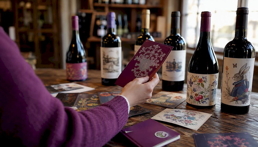
Design Elements That Make Labels Look Professional

Strong labels rely on hierarchy and space, not decoration. Experts consistently point to typography and strategic white space as the real workhorses of a memorable label — not busy graphics.
Here’s how to apply that in practice:
Typography hierarchy: Your brand or recipient name is the star. Make it the largest element. The varietal or occasion sits below it at a medium size. Supporting details (vintage, region, ABV) go small at the bottom.
White space: Don’t fill every inch. Breathing room makes a label look polished and lets the eye travel naturally to the most important line.
Imagery: One icon or illustration, max. A single grape cluster, a line-drawn vineyard, or a monogram works far better than a collage. When in doubt, skip the image entirely and let the type carry it.
Color vs. bottle: Always test your color choices on a printed mockup against the actual bottle. A label that looks great on screen can disappear against a dark bottle.
Before/after example: Take a label with three fonts, a border, a crest, and a paragraph of tasting notes. Remove the crest, pick one font pairing, cut the tasting note to one line. The result reads cleaner and the name pops.
Pro Tip: Limit yourself to two complementary fonts — one for the main name, one for supporting text. Set your primary name at a minimum of 24pt so it’s readable from across a table.
What File Specs Does Your Printer Actually Need?
Get these right once and you’ll never have a color-shift surprise again.
Spec | Requirement |
Label size | Measure smooth area; common starter: 3.5" x 4" |
Bleed | 1/8" (0.125") on all sides |
Resolution | 300 DPI at final print size |
Color mode | CMYK (not RGB) |
Export format | PDF/X-1a or high-quality PDF with fonts outlined |
Vector logos | EPS or SVG preferred |
Why CMYK matters: RGB is for screens; CMYK is for ink. Converting at the last minute can shift your deep burgundy to a muddy brown. Set CMYK from the start.
Pre-export checklist:
Confirm canvas size matches your dieline
Switch color mode to CMYK
Check resolution at 300 DPI
Outline all fonts
Embed all linked images
Add crop marks and bleed in export settings
Save as PDF/X-1a
How to Choose the Right Label Material and Finish
The material is where a lot of gift-givers get tripped up. A gorgeous design on the wrong stock can bubble, peel, or fall apart in an ice bucket.
Matte: Understated, elegant, easy to write on. Great for artisanal gifts and room-temperature display.
Glossy: Vibrant colors, eye-catching shine. Works well for modern or fun styles.
Kraft paper: Rustic, tactile, warm. Pairs perfectly with the old-timey aesthetic and food and beverage trends leaning toward natural, handcrafted packaging.
Waterproof vinyl or polypropylene: The only real choice for chilled bottles or ice-bucket service. Standard paper labels will bubble and tear in refrigeration.
Metallic/foil or embossed: Premium feel, higher cost. Reserve for special occasions where perceived value matters.
Practical rule: if the bottle is going in a fridge or an ice bucket, go waterproof. If it’s a shelf display or a gift box, matte or textured paper is lovely.
Pro Tip: Order a sample swatch or print one sheet before committing to a full run. Colors and textures look very different in person than in an online preview.
Printing Options: Home, Online, or Local Shop?
You’ve got three realistic routes, and the right one depends on your timeline and quantity.
At-home printing
Best for: urgent small batches, testing, one-off gifts
Use Avery label sheets (compatible with most inkjet and laser printers) or similar adhesive sheets
Limit: color fidelity won’t match professional printing, and standard paper stock has no water resistance
Online label printers and design tools
Canva offers free, customizable wine label templates you can download or order printed
Adobe Express provides ready-made templates with a common starting canvas of 3.5" x 4" for standard labels
OnlineLabels and Avery both offer free dieline templates and print-at-home sheets
Sticker Mule and Vistaprint handle short professional runs with specialty finishes and fast turnaround
Local print shops
Best for: specialty finishes (foil, embossing), larger batches, hands-on proofing
Slower turnaround and potentially higher minimums than online services
What to ask any printer:
Do you accept PDF/X-1a files?
Can I see a material swatch before ordering?
What’s your proof policy for color accuracy?
What’s the minimum order quantity?
Do you provide a dieline template?
How to Apply Labels Without Bubbles or Crooked Lines
Prep is everything. A clean, dry bottle at room temperature is your best friend here.
Clean the bottle. Wipe the label area with a lint-free cloth. Any dust, oil, or moisture will weaken adhesion.
Make a positioning guide. Cut a strip of paper the same width as your label and tape it around the bottle at the desired height. This keeps every bottle consistent.
Align with the seam. Use the bottle seam as a reference point for centering, but don’t place the label directly over the seam — it creates a bump that lifts the edge.
Press center outward. Peel the backing, align the center of the label first, then smooth outward toward the edges to push out air.
Removing old labels: Soak paper labels in warm soapy water for 30 minutes. For stubborn adhesive, a baking soda paste works faster than soapy water alone.
Pro Tip: Label one bottle first and use it as a physical guide for the rest of the batch. Consistent placement makes a set of gift bottles look intentional and polished.
Common Beginner Mistakes and How to Fix Them Fast
Label too tall or too wide: It wraps onto the shoulder or tapers. Fix: remeasure the flat cylindrical area and resize your template before reprinting.
Low-resolution images: Blurry print result. Fix: use vector graphics (SVG/EPS) or source images at 300 DPI minimum.
Wrong color mode (RGB): Colors shift at print. Fix: convert to CMYK in your design tool before exporting.
Paper labels on chilled bottles: Bubbling and peeling. Fix: switch to waterproof vinyl or polypropylene stock.
Weak adhesion: Label slides or lifts. Fix: clean the bottle surface thoroughly; consider an adhesive primer for glass.
Quick troubleshooting scan: Wrong size? Remeasure and reprint one test. Blurry? Check DPI. Color off? Convert to CMYK. Label peeling? Check material and surface prep.
Tools and Templates to Get You Started Right Now
You don’t need to start from a blank canvas. These tools make custom wine label ideas accessible in minutes:
Canva: Free wine label templates, drag-and-drop editor, direct print ordering. Best for quick mockups and beginner-friendly design.
Adobe Express: Ready-made templates, easy resizing, clean export options. Good when you want slightly more control over typography.
Avery: Free dieline templates sized to their label sheets, designed for at-home printing. Download, customize in Word or Canva, print on Avery sheets.
OnlineLabels: Free templates for dozens of label sizes, compatible with most design software. Great when you need a specific dieline.
When to use a template vs. custom design: use a template for gifts, parties, and first-time projects. Go custom when you’re building a brand or want a truly unique look.
Want to go deeper on wine knowledge while you’re at it? Blameitonbacchus offers beginner wine classes that pair perfectly with a label-making project — because knowing what’s inside the bottle makes designing the outside a lot more fun. You can also explore wine basics for foundational knowledge that’ll inform everything from your label copy to your tasting notes.
Ready to put your label on a bottle and make it a real gift? Blameitonbacchus has everything you need: beginner wine classes to build your confidence, private group sessions for parties and events, and wine-themed gifts for the wine lover in your life.
Book a private class for your next event, or browse the shop for wine-themed gear that pairs beautifully with a custom-labeled bottle.
Key Takeaways
A great wine label comes down to four things: the right size, the right file specs, the right material, and a clean, simple design.
Point | Details |
Measure before you design | Always measure the bottle’s smooth cylindrical area before choosing a template size. |
Use CMYK at 300 DPI | Set color mode to CMYK and resolution to 300 DPI, and include 1/8" bleed in your export. |
Match material to use | Choose waterproof vinyl or polypropylene for chilled or ice-bucket bottles; matte or kraft for display gifts. |
Keep design simple | Limit fonts to two, use one focal graphic, and let white space do the heavy lifting. |
Test before the full run | Print one label on the actual material and apply it to the bottle before ordering in quantity. |
The real secret to a label that works
Here’s something I see beginners skip every single time: the test print. Everyone wants to jump straight from the design file to a full batch, and that’s where things go sideways. A color that looks rich and deep on your monitor can print flat and dull on matte paper. A label sized perfectly in Canva can be a half-inch too tall for the actual bottle.
At Blameitonbacchus, we teach wine from the ground up — and the same principle applies here. Start small, test early, adjust once. A single printed label on the real bottle tells you more than an hour of screen-staring. Gift-giving projects especially benefit from this approach, because the stakes feel higher and the margin for “oops” is lower. The good news? With free templates from Canva or Avery and a home printer, your test costs almost nothing. Do it. Every time.
Useful Sources and Next Steps
These are the key resources behind this guide, along with what each one is best for:
Source | Best For |
Avery Blog | Step-by-step workflow, application tips, dieline templates for home printing |
99designs | Style categories, design inspiration, and creative direction for beginners |
Liendesign | Typography guidance, material advice, and avoiding common design mistakes |
Adobe Express | Free templates, quick exports, beginner-friendly online editor |
Creative shape and material ideas, die-cut options, eco-friendly stock |
Vendor checklist — ask your printer:
Do you provide a dieline template for my label size?
What’s your proof policy, and can I approve a color proof before the full run?
Can I order a material swatch sample?
What file format do you prefer (PDF/X-1a, native file)?
Want to keep learning? Blameitonbacchus has beginner-friendly resources on reading wine labels and bottling homemade wine that make great companions to this guide.
FAQ
What size should a wine label be for a standard bottle?
A common starting size is 3.5" x 4" for standard wine bottles, but always measure the smooth cylindrical area of your specific bottle before finalizing your template.
Do I need to use CMYK for printing wine labels?
Yes. CMYK is the color mode printers use, and designing in RGB can cause significant color shifts when your file goes to print — especially with deep reds and purples common in wine label design.
Can I print wine labels at home?
Absolutely. Avery label sheets work with most home inkjet and laser printers and are a great option for small batches and gifts. For water-resistant or specialty finishes, online services like Sticker Mule or Vistaprint offer short professional runs.
What material should I use for wine labels on chilled bottles?
Use waterproof vinyl or polypropylene. Standard paper labels will bubble and peel in refrigeration or ice buckets — water-resistant stock is the only reliable choice for chilled service.
Do gift wine labels need to follow TTB regulations?
Retail labels sold commercially must meet TTB requirements including brand name, class/type, ABV, net contents, and a government warning. Personal gift and hobby labels don’t face the same legal requirements, but should still avoid any misleading claims.
Recommended
Comments